Dashboard Customization
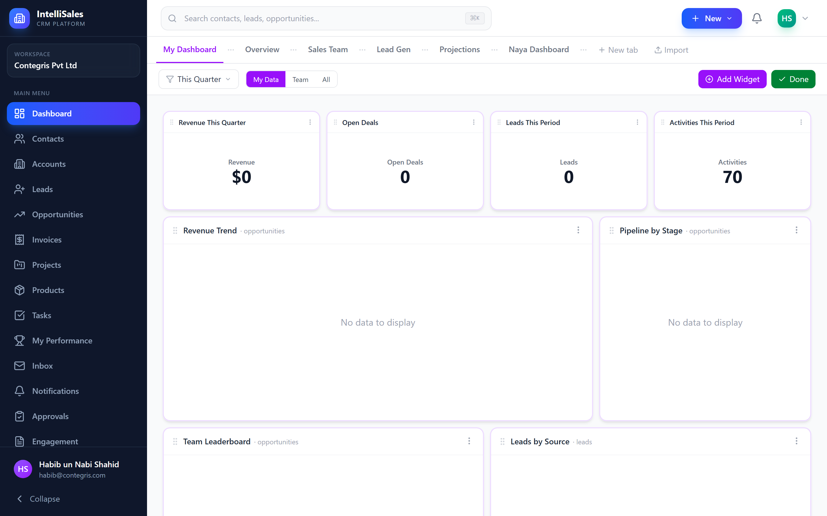
IntelliSales CRM dashboards are fully customizable. You control which widgets appear, where they sit, and how large they are — creating a workspace that matches your workflow exactly.
Edit Mode
Dashboards have two modes:
- View mode (default) — widgets display data; layout is locked
- Edit mode — widgets can be added, moved, resized, and deleted
To toggle edit mode, click the Edit button in the dashboard toolbar. When you are done, click Done to lock the layout.
Adding Widgets
- Enter Edit mode by clicking Edit.
- Click the Add Widget button.
- A widget catalog panel opens, listing all available widget types grouped by category.
- Click a widget type to add it to the dashboard.
- The new widget appears on the canvas, ready to be configured and positioned.
Browse the widget catalog to discover new visualizations. Each widget has a brief description to help you understand what data it shows.
Configuring Widget Settings
After adding a widget (or by clicking the gear icon on an existing widget in edit mode):
- A settings panel opens for that widget.
- Configure options such as:
- Title — the display name shown on the widget header
- Data source — which module or metric to pull data from
- Pipeline — select a specific pipeline (for pipeline-related widgets)
- Chart type — switch between bar, line, pie, etc. (where applicable)
- Color scheme — customize chart colors
- Font size — adjust text size for scorecards
- Time period — override the dashboard-level date filter for this widget
- Click Save or Apply to confirm your settings.

Drag-and-Drop Positioning
In edit mode, widgets can be freely repositioned:
- Click and hold the widget header (or drag handle).
- Drag the widget to its new position on the grid.
- Release to drop it in place.
The dashboard uses a 12-column grid system with free-form placement. Widgets snap to grid positions for clean alignment.
Widgets will not overlap. If you drag a widget over another, the other widgets shift to make room.
Resizing Widgets
To resize a widget in edit mode:
- Hover over the bottom-right corner of the widget until you see the resize cursor.
- Click and drag to make the widget larger or smaller.
- Release to set the new size.
Widgets have minimum size constraints to ensure their content remains readable.
Duplicating Widgets
To create a copy of an existing widget (including its configuration):
- In edit mode, click the options menu (three dots) on the widget header.
- Select Duplicate.
- A copy of the widget appears on the canvas with identical settings.
- Modify the duplicate's settings as needed.
Duplicating is useful when you want the same widget type with slightly different filters — for example, two pipeline funnels for different pipelines.
Deleting Widgets
To remove a widget:
- In edit mode, click the options menu (three dots) on the widget header.
- Select Delete.
- Confirm the deletion if prompted.
Deleting a widget removes it and its configuration permanently. If you want it back, you will need to add and configure it again from scratch.
Exporting the Dashboard
You can export your dashboard in several formats:
JSON Export
Exports the dashboard layout and widget configuration as a JSON file. Useful for backup or sharing configurations with colleagues.
- Click the Export button in the dashboard toolbar.
- Select JSON.
- The file downloads automatically.
PNG Image Export
Captures a screenshot of your current dashboard as an image.
- Click the Export button.
- Select PNG.
- The image downloads automatically.
PDF Export
Generates a PDF document of your dashboard, suitable for printing or emailing as a report.
- Click the Export button.
- Select PDF.
- The PDF downloads automatically.
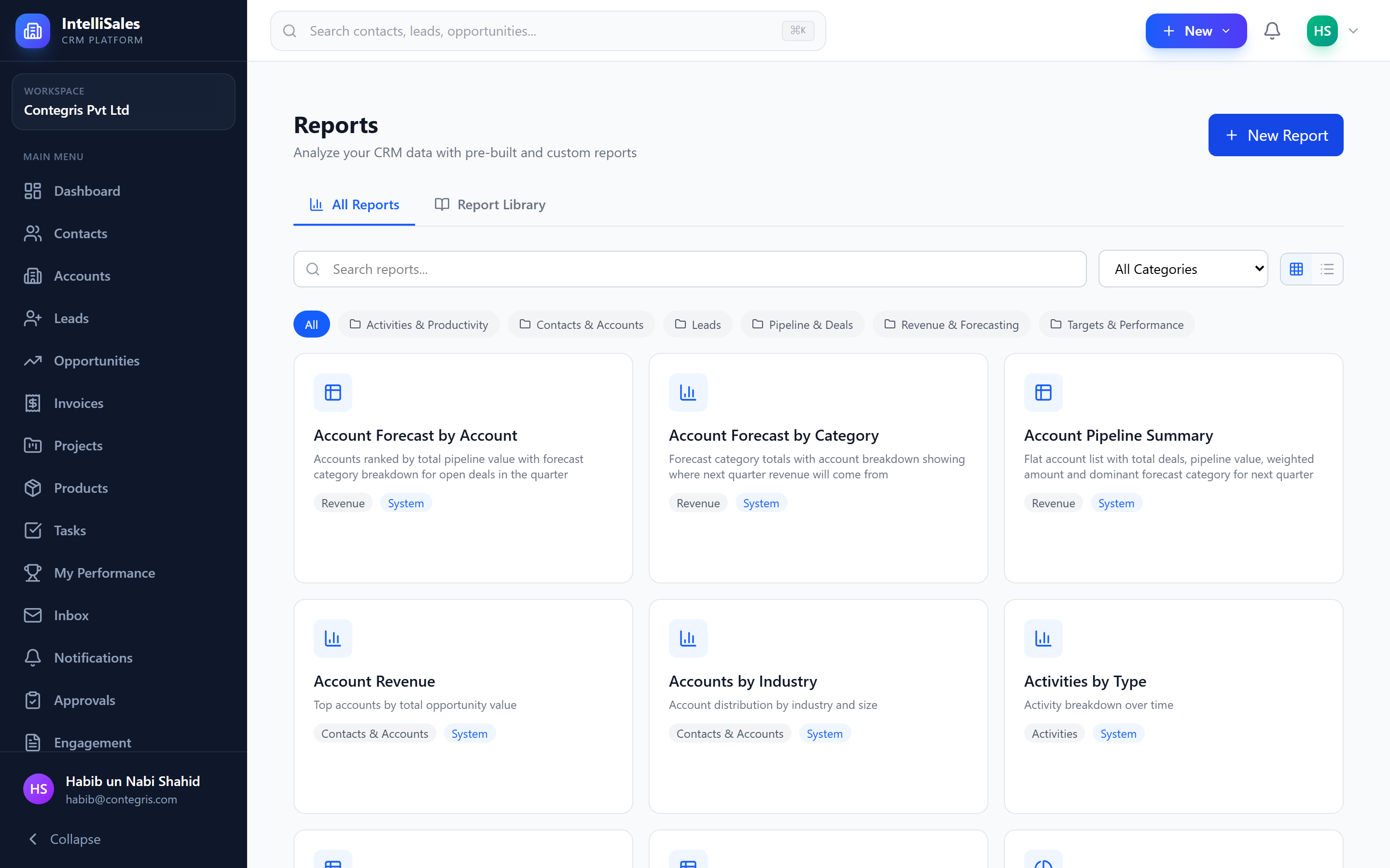
Exported images and PDFs capture the dashboard as it currently appears, including any active filters. Adjust your filters before exporting to get the exact data snapshot you need.
For details on available widget types and what data they show, see Dashboard Widgets.
Sharing Dashboards
Role-based sharing and the dashboards RBAC module ship with migration 080. Run npx ts-node apps/api/src/scripts/run-tenant-migrations.ts to apply.
Dashboards now have their own RBAC module — separate from Reports — with six permissions: view, create, edit, delete, share_role, share_public. Migration 080 mirrors your existing report-equivalent permissions so behaviour stays the same until an admin tunes it.
Open a dashboard → Share in the toolbar to open the Share Dashboard modal. It has two independently RBAC-gated tabs:
- Roles — pick one or more roles to share with. Anyone in those roles sees the dashboard on their next visit. The first time each user opens it, they get their own clone of the layout, so they can tweak filters and widget positions without affecting other members of the role. Requires
dashboards.share_role. - Public Link — generate a tokenised URL anyone can open without logging in. Useful for embedding inside a wiki or sending to a stakeholder. Requires
dashboards.share_public.
Auto-seeded default dashboards
When you're created in the tenant — whether by an admin or by accepting an invite — the system auto-seeds a default set of dashboards onto your account so you don't land on an empty page. The seed also runs lazily on the first dashboard list read, in case your account predates the auto-seed.
Dashboard Tabs
Each dashboard can hold multiple tabs (Sales, Pipeline, Activity, etc.). Right-click any tab — or click the ⋮ chevron — for the tab context menu:
- Set as default — this tab is the one you land on when opening the dashboard.
- Tab settings… — open the per-tab options panel.
Per-tab settings
- Default date range —
last_7_days,last_30_days,this_quarter,ytd, or a custom range. Widgets inherit it unless they override. - Available date range options — pick which presets show in the toolbar dropdown for this tab.
- Default scope —
own(your records),team(your team), orall(tenant-wide, intersected with your record-access scope). - Available scope options — same idea: limit what users can switch between.
The scope picker now actually filters data — earlier versions of the toolbar control were decorative. Scope choices are always intersected with the user's record-access RBAC, so an all-scoped widget on a user with team-only access will still only show their team's data.
Per-Widget Date Range
Each widget has its own date range and date field instead of inheriting a hardcoded created_at. In the widget settings panel:
- Date field — choose which column drives the date filter (
created_at,closed_at,last_activity_at, etc.). - Date range — override the dashboard / tab default if this widget needs a different window.
Additional Builder Controls
The widget settings panel exposes a long list of new controls. Imports of older dashboards are now lossless — settings that weren't editable before are preserved when re-exported.
| Control | What it does |
|---|---|
refreshInterval | Auto-refresh the widget every N seconds. |
reportType | For table widgets — switch between summary and detail report styles. |
trendField | Field driving the trend sparkline on scorecards. |
trendGranularity | day, week, month. |
rankBy | Column used for ranking on leaderboard widgets. |
colorScheme | Palette for chart widgets. |
sliderStep | Tick size on the dashboard timeline slider. |
projectionMeasure | The numeric column the forecast widget projects. |
baseSeriesLabel / projectedSeriesLabel | Series labels on the forecast/projection chart. |